


PANGEA
Redesigning the Weather Channel Map Experience
Client: The Weather Channel
Industry: Weather Forecasting
Project Type: Cross Platform
Role: Product Designer
Research, User Testing, Prototyping, Interface Design
Intro
OVERVIEW
Executive Summary
This project aimed to enhance the user experience of the Weather Channel’s map interface. Maps are a core feature for visualizing and interacting with weather data, and the company identified opportunities to improve usability and introduce new features powered by advanced backend weather sources. By addressing navigation challenges and evaluating potential features, the team sought to create an intuitive, engaging experience. The results included improved clarity, simplified navigation, and recommendations for integrating impactful new features.

OVERVIEW


Problem Statements
Challenge 1
Users faced difficulties navigating the map interface and understanding key features like radar timestamps, legend interaction, and saving locations. These issues hindered their ability to efficiently access weather data, impacting satisfaction and engagement.
Challenge 2
New backend weather sources provide an opportunity to introduce innovative map features. The company needed to determine which new functionalities would deliver the most value while maintaining a seamless user experience. User testing was required to assess the potential of these features and prioritize their inclusion.

Driving The Redesign
1.
GOALS
Objectives
User Goals
Simplify map navigation, enhance clarity of weather data, and improve the intuitiveness of saving and searching both existing and new features.
Business Goals
Increase app engagement by 15%, reduce user drop-off rates, and identify the most effective features to integrate from the new backend weather sources
2.
ASSUMPTIONS
Hypothesis
-
If the legend opens by default, users will more easily find and interact with it.
-
If timestamps are made larger and more legible, users will engage with radar animations more effectively.
-
If scrolling cues are added, users will navigate layers panel with fewer errors.
-
If new backend features are prioritized based on user feedback, the interface will better meet user needs.
The Iterative Approach
RESEARCH
DESIGN
VALIDATION
Methods
Observational usability tests, A/B testing of existing features, and prototype testing of new features.
Participants
Seven users with diverse demographics, tested at Cumberland Mall and Starbucks Camp Creek in Atlanta.
Tools
Designed in Sketch, prototype built in Proto.io, featuring existing and new map functionalities.


RESULTS
Findings
Improved Timestamps
Enlarged text and highlighted timestamps during radar animation.
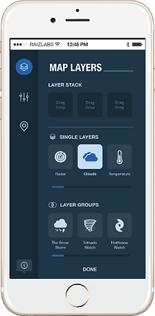
Legend Redesign
Default open with a toggle option simplified access.
Scrolling Cues
Added visual indicators to assisted with Layers navigation.
New Feature Prototyping
Refined concepts for weather alerts and automated layer suggestions, aligning them with user expectations for seamless integration
RESULTS
Metrics

Preferred a top-right menu

Success rates for tasks like adjusting layer opacity and finding the legend.

Legend at the top of the screen.

Users’ enthusiasm for new features validated their inclusion in future iterations.

Measuring Success and Growth
3.
IMPACT & INSIGHTS
Outcomes
User Outcomes
Simplified navigation and feature clarity led to faster task completion.
Testing validated the demand for automated and dynamic map features.
Business Outcomes
Increased user engagement with map features.
Identified new weather-powered features likely to drive satisfaction and retention.
4.
IMPACT & INSIGHTS
Lessons Learned
-
Successes:
Iterative testing validated key user needs and highlighted the potential of backend-powered features like weather alerts.
-
Challenges:
Balancing existing feature refinement with testing and integrating new capabilities required careful prioritization.
-
Takeaways:
Early testing of new ideas with users ensures alignment with both technical possibilities and user expectations.
Design Files
View all the key deliverables from the design process, showcasing the evolution of the project from ideation to testing. It provides a comprehensive view of the design journey and its outcomes.
Wireframes
View some of the high-fidelity layouts that outline the structure and functionality of the design.
Prototype & Script
An interactive model paired with the user flow script to demonstrate and test key features.
UX Test Results
Insights and data collected from user testing to validate the design and guide improvements.